__________
POSTER #1 | Spaci

This poster is composed by shades of grey - so no colours except the primary red or magenta, really pure hue. This red contrasts with the background and represents the danger. It is a metaphor for blood and all the violence that war brings: invasion, family protection. I think this use of the colour is really efficient in this picture.
__________
POSTER #2 | To-day

Propaganda is a politic tool. Most of the time, it uses colours of a country. This is the reason is hard to find propaganda posters using green, purple or orange.
This poster uses pure orange and purple with low value/luminance, really opaque colours. Quite ironic for a poster with a sun. I don't think the choice of those colours is efficient. Complementaries colours would have been more appropriate - a bright yellow instead of the orange - to contrast and bring the idea of hope.
This poster uses pure orange and purple with low value/luminance, really opaque colours. Quite ironic for a poster with a sun. I don't think the choice of those colours is efficient. Complementaries colours would have been more appropriate - a bright yellow instead of the orange - to contrast and bring the idea of hope.
__________
POSTER #3 | Neues Volk

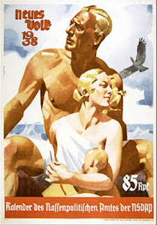
This poster uses tertiary and analogous colour. The colour palette is a declination of tints with low chroma but high luminance. The effect is really nice and in compliance with the statement: the high luminance goes with the beach (sun, nice weather and by extension having a good time) and the analogous colours bring this idea of a coherent group, harmony and peaceful lifetime.
__________
POSTER #3 | Neues Volk

__________
POSTER #5 | Jo-Jo la Colombe

This poster is a French caricature of Stalin. The use of the complimentary colours blue and red is really efficient. The blue (high luminance, low chroma so quite sweet) on the background and on the panel saying ''PAIX'' (peace) contrasts with the pure hue red wearing by Stalin and on his weapon. The contrast of those colours shows Stalin's double game the poster wants to denounce.
Plus, we can't ignore that the red is a powerful symbol of the Communism in general and Stalin in particular.