Showing posts with label Design Principles C. Show all posts

Design Principles | Me Designer Final Result


Concept

I chose to become a graphic designer so that I could tell stories to all people, regardless of the language they speak.

I have a strong background in French literature and French language. As such, I have absolutely no issues or frustrations in accurately expressing myself through the French language. However, when I started travelling, the question of self-expression became trickier.

I wanted to express in my “Me Designer” Poster how graphic design can break the limits of language. Through graphic art, I can potentially inspire and touch audiences across the world, regardless of the language or the social class.

In my poster, the circles represent different spaces or areas. Those spaces can be concrete, like Europe, North America or Australia (places where I have lived), or abstract.

I used the closure principle and transparency to make the spaces appear in the different circles and a silhouette of a character representing myself. I only used shade of greys, and the circles are actually blank spaces. My silhouette transcends those spaces and travels through them.

The melting painting represents creativity and expression. It comes from me and from all the spaces around me and from my past. I use it, spread it, mix it, get inspired by it, etc. The way the paint melts transforms the circles into spheres. The bright, high chroma colors contrast with the greys of the backgrounds. The overarching composition of the poster follows the golden section.

To conclude, I wanted to highlight the loop of the creativity:

Observation <-> Expression <-> Reception

Those three elements influence one another. To symbolize the loop, I made the drops of paint match from the bottom to the top of the page.

Finally, I inserted the words ‘’Me Designer ‘’ at the end by using the same process which was used to create the blank circle. I made each letter connect or interact with each other because this is what graphic design is about: linking things and people though an international language.

Design Principles | First Illustrator Draft


Design Principles | Me Designer Mind Map & Sketches

Mind Maps


Sketches


Design Principles | Luba Lukova

Poster #1
In this poster, Lukova used figure and ground to reveal two levels of comprehension. 
First, the obvious one in black and white. There are two pairs of dance shoes, one feminine and one masculine. The figure and ground principle reveals a heart and an arrow. The artist used hight chroma red and blue to highlight those element.

The design is an axial symmetry (minus the text).


Poster #2

Once again, there are two levels of comprehension in this design. On in black and white (woman with hands and baby) and one in high saturation red. Unlike the poster one, the second level is inside the first one. Lukova used the shapes and colours of the hands and the baby to match with the eye of the red head.

The composition is axial but not vertical


Poster #3
Lukova used figure and ground and point symmetry. This design can relate to the Yin Yan symbol.
The black still have a large place in this design. The background is a high saturation red and the rest is hight value red.


Aesthetic And Functional Consistency of Lukova


Lukova used in all her artworks high saturation colors, pure hue without (almost every time) shades, tints or tones. The shapes are really simple and even the blank spaces still have meanings. She uses nearly always figure and ground or closure.

I think this is why her work is so powerful: beyond its apparent simplicity, there is actually a very elaborate design and a strong statement.


Design Principles | Visual Structures


Design Principles | Post Cards Final Result

Moments in your life when it is relevant 

to send or receive a post card


Post Card #1 | BIRTH

I used the shape of the B to symbolise the pregnant body. To highlight this idea I cut the B to remind the shape of an arm holding the belly.
I used the principle of continuity and did the same with the H inside the B, symbol of the infant inside the belly.
I used analogous colours of blue because this colour symbolises something new.

Post Card #2 | GRADUATION

For this postcard, I used closure to reveal a graduation hat.
I used the background to complete the closure effect.
The placement of the letters matters as well: I wanted to show the idea of evolution so the R is bigger and above the G.
I chose yellow and and orange because they symbolise achievements. They are bright and warm which brings the ideas of hope and having the life ahead.

Post Card #3 | Wedding

The two letters are united - symbol of the marriage.
Then I added little letters. The similarity, proximity and position give the illusion of bubbles in a liquid and bring the idea of champagne.
The red and pink express the passion and love.

Post Card #4 | Death

The principle of closure reveals a coffin. The position of the little white A comes strengthen this image.
The letters are lying down and their axe is going down to symbolise the fall of the death.
The dark blues bring the idea of the night and the end of the journey.

The 4 Post Cards

The four postcards represent four key moments in the life and they belong to a coherent group. I wanted to show it by linking them and make them work together as well.
Once positioned side by side, the background colours reveal a continuation showing when life evolves and declines. This movement is also visible in the positions and the axes of the letters.

Design Principles | Post Cards First Draft and Colour choice

Here the first draft of my post cards:

The choice of the colours is nor random:

  • Blue: the blue represents something new. Quite relevant for a birth
  • Yellow: represents the achievement
  • Wedding: red for passion/love
  • Death: black, colour of grieving


Few things were not right:

  • I needed to add a second dominant colour
  • The black can't be a dominant colour
  • I put to many detailed elements. I need to follow the design used on the DEATH post card

Design Principles | Post Cards Brainstroming

To find my aspiration, I took the assessment sheet: the design is about post cards. It is an important point. It is a significant support. Post cards have a purpose. I decided to axe my post cards around the theme of ''Moments in the life when it's relevant to send (a receive) a post card''.

I chose 4 moments: the birth, the graduation, the wedding and the death.


For each, I wrote the ideas I wanted to express:
  • Birth: new/duplicate
  • Graduation: evolution/next step
  • Wedding: union
  • Death: end/missing element

Design Principles | Task #6 Colours in posters

I chose my posters from the propaganda production, mainly during WW2 period.

__________

POSTER #1 | Spaci

This poster is composed by shades of grey - so no colours except the primary red or magenta, really pure hue. This red contrasts with the background and represents the danger. It is a metaphor for blood and all the violence that war brings: invasion, family protection. I think this use of the colour is really efficient in this picture.


__________

POSTER #2 | To-day

Propaganda is a politic tool. Most of the time, it uses colours of a country. This is the reason is hard to find propaganda posters using green, purple or orange.
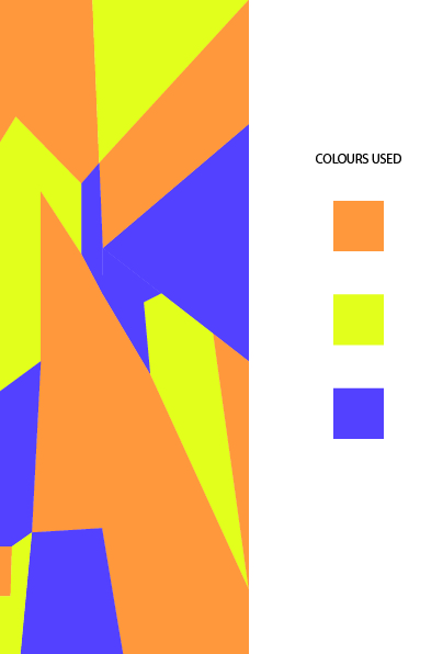
This poster uses pure orange and purple with low value/luminance, really opaque colours. Quite ironic for a poster with a sun. I don't think the choice of those colours is efficient. Complementaries colours would have been more appropriate - a bright yellow instead of the orange - to contrast and bring the idea of hope.


__________

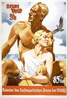
POSTER #3 | Neues Volk


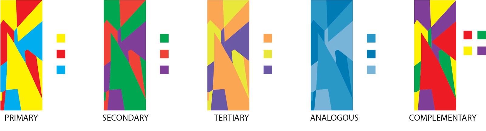
This poster uses tertiary and analogous colour. The colour palette is a declination of tints with low chroma but high luminance. The effect is really nice and in compliance with the statement: the high luminance goes with the beach (sun, nice weather and by extension having a good time) and the analogous colours bring this idea of a coherent group, harmony and peaceful lifetime.


__________

POSTER #3 | Neues Volk


This poster seems to use analogous colours. Actually I think it is more tints and shades of orange. The use of the declination of the orange formulates a coherent set. Graphically speaking, I like the use of colours from the same palette (analogous, tints, shades or tones) but most of graphic works - especially propaganda - need to carry a powerful statement and the use of colour should help. Here per example, the bonds notes are not clear enough and must be given prominence.


__________

POSTER #5 | Jo-Jo la Colombe

This poster is a French caricature of Stalin. The use of the complimentary colours blue and red is really efficient. The blue (high luminance, low chroma so quite sweet) on the background and on the panel saying ''PAIX'' (peace) contrasts with the pure hue red wearing by Stalin and on his weapon. The contrast of those colours shows Stalin's double game the poster wants to denounce.
Plus, we can't ignore that the red is a powerful symbol of the Communism in general and Stalin in particular.

Design Principles | Task #5 Colours


Design Principles | Task#4 Gestalt Principles

Continuation (+ similarity)

Proximity (+ similarity)

Reitification

Similarity

Closure (+ similarity)

Design Principles | Task#3 Week 5

Image #1

 MC Escher - Rippled Surface - 1950

The lines of the branches are continuous. The rippled effect is due to the fact that the lines still parallel despite the zigzags. As a whole, the rippled effect seems really complex and elaborate. But when you look closer and take each branch separately, you realize the basic idea is actually really simple. 

But the repetition of this basic idea, plus the superposition and the circle organisation lead to a really elaborate concept.

Image #2

MC Escher - Metamorphosis - 1937

If we compare the top left of the image with the top right, there is absolutely nothing in common. But if you take the picture from one side, and move cm by cm on the other side, the continuation is really obvious

Let's take the picture from the right to the left. You start with a little Chinese character. every time you move your eyes on cm on the right, just few tiny details have changed but you still notice the similarity. The Chinese character is slowly getting simpler and get insert in a pattern in a 3 shades: light, medium and dark (like the background).

This dark is becoming the shadows: the empty space becomes an actual part of another drawing.

The continuation is working perfectly because also of the utilisation of only 3 colours the artist will shades.

Font Design | Marinière 89


To create my font, I use Champagne & Limousine as a basis.


First, I found the name of my font: Marinière 89.


In French, a Marinière is the stripes shirt worn by marines.


I inserted stripes in each letters and I curved them to remind the move of a wave.

I also added an anchor on the dots of the i and j.

Design Principles | Task #2

Champagne & Limousine

What really makes me appreciate this font is the aesthetic and functional consistency.

The aesthetic consistency is really obvious because you can easily notice how each character inspires an other:
  • the d is actually a a with an ascender
  • the C is a O cutting - so the bowl is exactly the same
  • the p is a o with a descender and a q is a reflection in mirror of the p
  • the n uses the exact same bowl than the u, reverse it and add a ascender to create the h
  • the f and the t are pretty similar except the ascender slightly curve for the f
  • etc.
You can pretty much link absolutely all characters.

The functional consistency is in the simplicity of those letters. The curves are pure, no useless decoration elements. 
All the letters share the same height between the baseline and the x height and it's quite clear when you have a look on the lower-cases.

The creator kept only the ascenders/descenders/arms/cross bars relevant for the recognition of the letters.

Moon Flower


My observations above about the functional consistency are quite relevant here as well. 

The only difference here will be about the aesthetic consistency. Actually, if you look at the bowls, or the curves, it' s quite irregular. Per example, the bowls and counter of the B P R or C, G O Q are slightly different.

But the simplicity and the consistency in the thinness of the line, the aperture and wildness built a relevant aesthetic consistency where the irregularities are actually a form of consistency. This consistency in the irregularities is one of the main part of the style cause it gives this hand writing aspect.

Can't Write Quickly on Winter

Even if this font had the most ''hand writing'' style, it shows more aesthetic consistency than the previous one:
  • h l and k share the exact same ascender
  • f g y share the exact same descender
  • etc.
Like Champagne & Limousine, you can pretty much link absolutely all characters reagarding different elements.

Create a font with a ''hand writing'' style is pretty challenging regarding the functional consistency and the readability. I do think the creator did here a good job. Of course it's less easy to read than Time New Roman but it's part of the compromise.

What really help the readability and strengthen the hand writing aspect is the consistency in the creating process: all lower cases posses an extension of the stroke in the end but not at the beginning. This will create an illusion of continuity once your place the characters next to one another.


Design Principles | Task#1

____________________

LIKE

This font is one of my favourite. I use it for my resume and to write my cover letters. It looks both professional and original.  
There are several aspects I appreciate:
  • thinness: makes it clear, light
  • roundness: makes it soft, cosy
  • simple: makes it really efficient 


I like this one once again because of the thinness but I also really appreciate the curve of the letters that are not completely straight, like they just have been hand drawn.


I really enjoy cursive fonts but it's not easy to find a good one. I like this one cause the style is good, it' s readable and it's really well built (connection between letters efficient)

____________________

DISLIKE

I don't like really bold fonts. I find them inelegant. And the melty effect makes the font messy and kind of dirty. This font is supposed to be used in a fear context but when I try to picture it the only effect this font does is making the result cheap.

This font uses characters design way too basic with no originality. And they add a ugly pattern that only blur the readability. 

Here another ugly pattern with really bad readability.


BONUS

I liked the concept and the design of the rope but clearly the readability failed: here you read ''rape''.